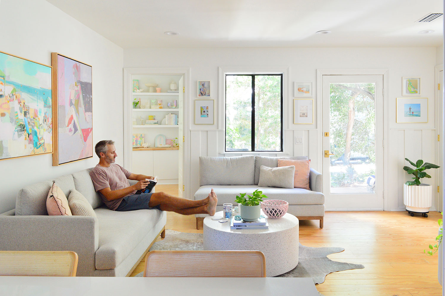
Since downsizing to our 1400 square foot house three and a half years ago (as a refresher, our previous house was more than twice as large – clocking in at 3150 square feet), you’ve probably heard us proclaim that smart storage is key. It certainly makes living in a smaller home a lot more sustainable and enjoyable, but there are also specific layout features of our house that make sharing less square footage go a lot more smoothly for us.
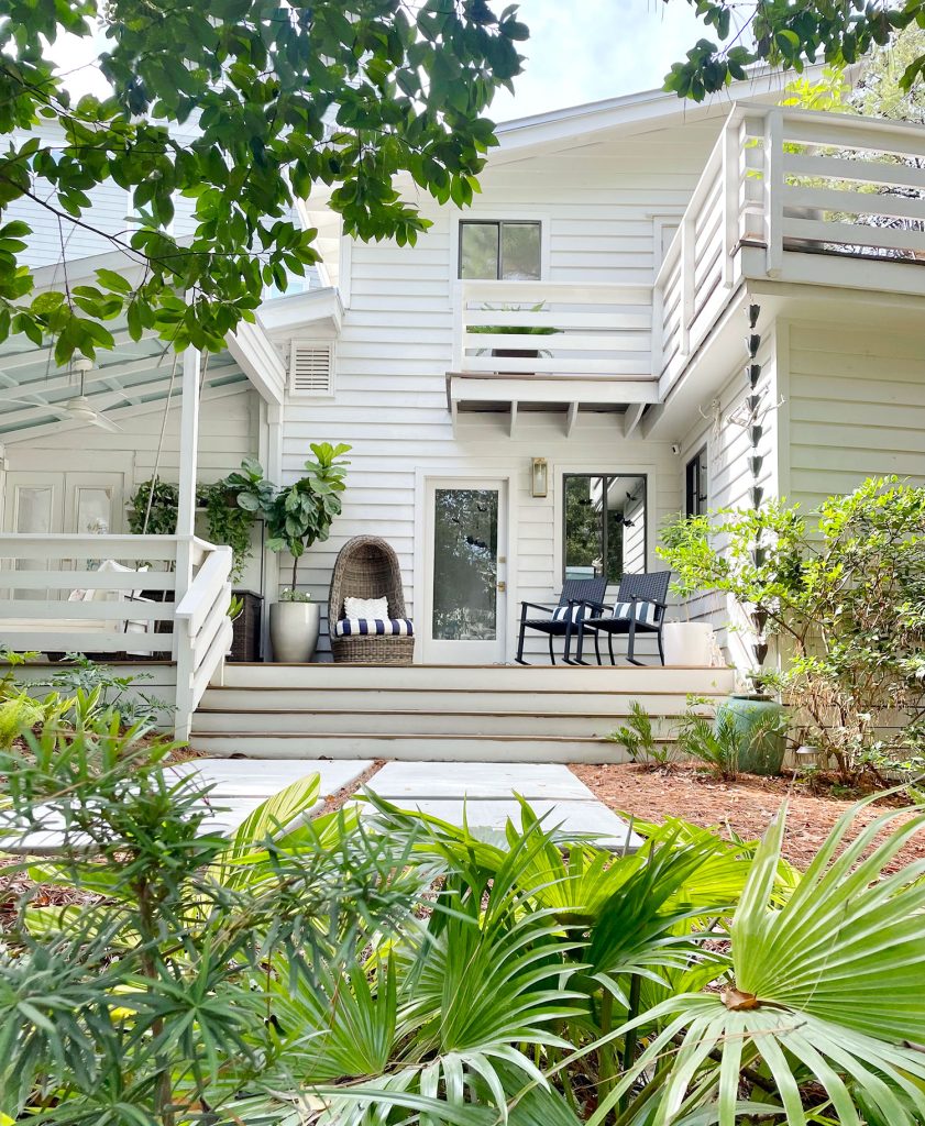
So whether you’re thinking of downsizing, considering a new home with any of these layout details, building a new home, or are just curious about what some of our favorite “living-larger-in-a-smaller-home” features are, we’ve put together the following list. Plus, we’re ending with one caveat that’s definitely smart to consider if you’re contemplating any layout decisions or changes.
#1: Separation Between Bedrooms
This feature is #1 on our list for a reason, and after living this way I think it would actually be difficult for us to go back to a layout without this feature. The thing that we love is that none of our 3 bedrooms share walls with each other. The kids have a hallway between theirs, and our bedroom is on the entire opposite side of the house (all of our bedrooms are on the first floor).
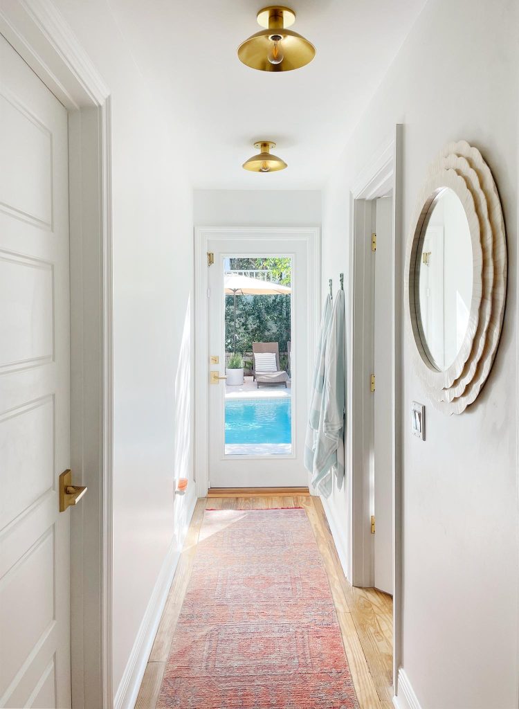

This separation helps everyone feel a bit less likely to be awakened by someone else banging around (we can watch some evening TV and erupt in laughter without worrying that we’ll wake up the kids) and each of our kids generally have a nice private feeling while they’re in their own rooms (they can each listen to different music or a podcast without hearing it through a shared wall for example).
People often worry about being “on top of one another” in a small house, and this little detail really helps us feel like that isn’t the case here (contrasted for example by our first house’s layout, which was a similar amount of square footage, but all three bedrooms emptied into the same end of a shared hallway). Even in our last house, which was more than twice the size, we shared a wall with our son’s room – so this layout update really feels like we’re living large.
#2: Two Distinct Living Areas (One On Each Level)
This one surprised us because our original thought was to make our downstairs common area (it’s a big 22′ room, about the same size as our last house’s very large kitchen) into just a kitchen & dining space with a nice big living room upstairs. In short, we didn’t initially think about using half of it for a first-floor hangout area with legit sofas and a coffee table – but that’s where we’ve ended up. And let me tell you, it’s a giant reason that we feel like this house works so much better for us and we don’t feel on top of each other – even when we’re entertaining and have 10+ people over.
When we finally renovated the kitchen last year, we cemented half of the room’s function as a hangout zone (since we used the casual sitting area on that side of the room so heavily for the previous two years). And this year we ordered two larger sofas to make it even more lounge-y and comfortable. And let me tell you, it was the best thing we ever could have done.
It’s great to have a big casual TV room/art space/hangout zone upstairs (we’ll cover what that room adds to this house in the next bullet). And as it turns out, our casual sitting area downstairs gets used heavily every day by our entire family – and anyone who stops in for a visit. It’s a great place to relax/read/chat that’s not upstairs in front of a TV and, because it’s centrally located, we spend MOST of our time as a family there every morning before school (and on weekends) and every evening before and after dinner.
It’s interesting because one thing you might think about a smaller home might be: don’t repeat zones like two sitting areas because two could be a waste of your precious space – but after living with this setup for years, we couldn’t disagree more. Since each of these living zones are on different floors, adults can hang out downstairs in the kitchen/sitting room while a whole gaggle of kids are upstairs playing some very loud game or music or watching a movie and nobody in either zone is bothered by the other one.
Even when it’s just the four of us at home, this layout Is great for allowing us to spread out. It’s extremely helpful that one kid can be upstairs watching TV while the other is down at the kitchen table doing homework or reading without being disturbed or distracted by the TV. We can’t imagine our house without the downstairs sitting area and are so glad we didn’t just stick a dining table in that spot or something.
#3: One Big Flexible Multi-Use Area
While we’ve never had basements as adult homeowners, both of us grew up with basements as kids, and they’re just so great for everything from sleepovers and movie nights to a spot for kids to do big messy art projects and have pillow fights or build a giant blanket fort (all of which have been done in our large upstairs family room). Our entire second floor is just one big room (it’s about 22′ long, like our kitchen below) so it’s basically… an upstairs basement of sorts… maybe?
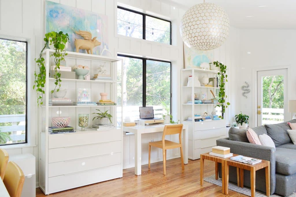

The point is that having a big space like this that fills a bunch of different functions for us has been incredibly useful. In fact, it does everything that three different rooms in our last house did (plus one added thing we didn’t even have in our last house!).
We call it our “family room” but it’s really a space that fulfills all of these descriptions:
- an office (we both use laptops that we can easily place on that desk in the window (and ALL of our work paperwork is stored in the bookcases with 8 total drawers that flank the desk on each side)
- a kids’ craft room with a double desk for them (complete with 12 drawers for craft supplies & a big 8′ long counter)
- a TV hangout space / sleepover spot (thanks to the extra long sofa, large area rug, and movable ottoman – it’s a super flexible side of the room)
- a spot for piano practice (one of our kids takes lessons, and we have a keyboard up there at a table with a bench – this is a bonus zone that our last house didn’t even have)
In short, this one large room easily accommodates loud or messy activities – like practicing piano, making art on the floor, the aforementioned giant blanket fort, watching a movie with friends, etc. And thanks to this room being tucked upstairs, all of that can happen without spilling over into the rest of the house. Whenever we have friends over, the kids all run upstairs while the adults congregate in the kitchen & sitting area, so once again those two separate zones are key to feeling like we’re not all on top of each other.
#4: Ample Outdoor Space
Although this lot is one-tenth of the size of our last house’s lot (yes, that’s not a typo, this lot is around 1/10th of an acre and our last house was on an entire acre) we squeezed as much function out of it as we could! So another thing that definitely contributes to feeling like we have room to spread out here is the fact that we have PLENTY of exterior spaces for a variety of things, like:
We’ve had as many as 20 people in our pool area (there’s actually seating for 19!) so it’s safe to say that these spaces give us more options for spreading out. I can go read in the hammock if it’s too loud inside or take my laptop out on the deck upstairs for a change of scenery – or even a conference call. We’re also able to offload some of our interior functions into these outdoor spaces, thanks to the weather being warmer here than when we lived further north. For instance, we keep our shoes outside on our kitchen porch’s outdoor cabinets, freeing up storage space inside.
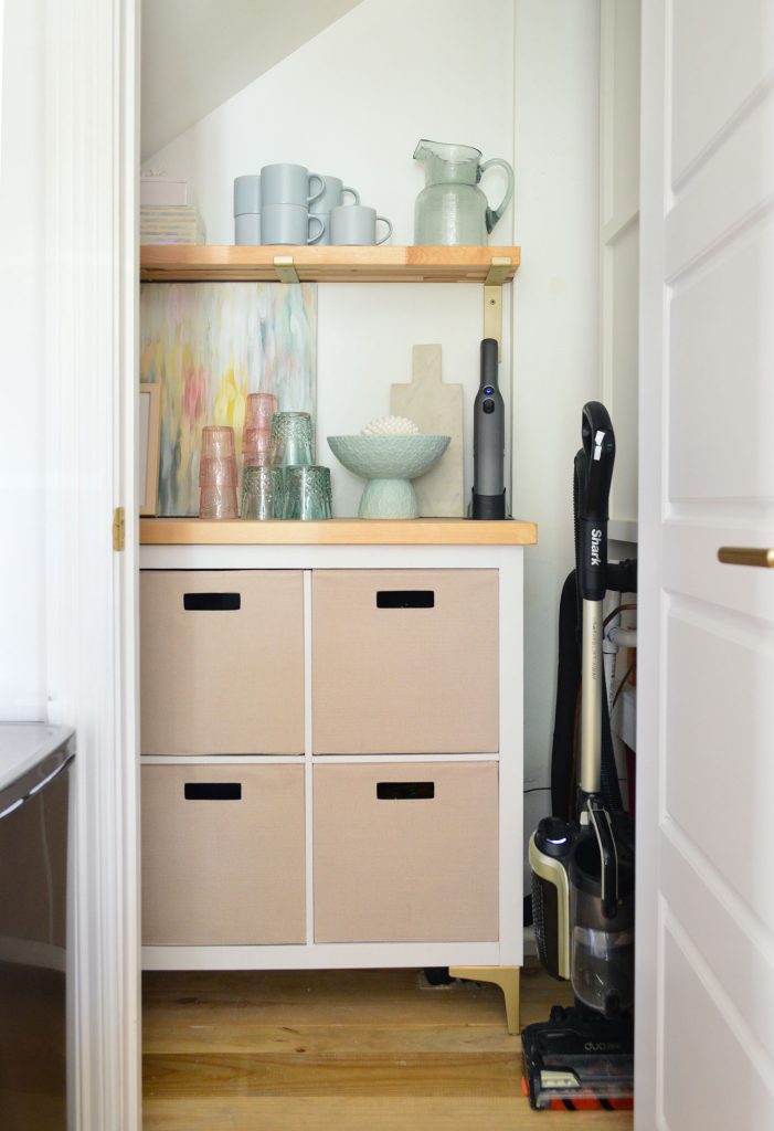
We also previously had a large water heater in a closet off of the kitchen, that we were able to move outside on the back of our house (by converting to a tankless system) which freed up an interior closet for a lot more function.

When we bought this house, I don’t think we fully appreciated the difference that a variety of outdoor spaces with a variety of functions could make (and in a variety of locations – off the front, side, back, and second floor of the house!). It definitely contributes to feeling like we live in a bigger house than we actually do thanks to all these spots we can expand into outside.
#5: Lots And Lots Of Glass
For its size, our house has a crazy amount of windows and exterior doors (all of which have full glass panes in them to boot). In fact, there are FOUR TIMES as many exterior doors here compared to our last house (12 vs 3) even though our house is less than half the size. The benefit to all that glass here is two-fold. First of all, we get a ridiculous amount of natural light, which makes all of our rooms feel brighter and less cramped than they might feel otherwise.
Additionally, all of these windows carry your gaze outside, beyond the walls – which further contributes to the airy feeling that our rooms are larger than they actually are… because the outside feels more like an extension of the floor plan. It’s one of the reasons we’ve opted not to put any window coverings on anything except for the smart blinds and blackout curtains in the bedrooms.
This so-much-glass-letting-in-so-much-light phenomenon was actually a pleasant surprise to us after moving in. It was rainy and overcast when we bought this house, plus there were lots of janky blinds on the windows. We actually expected the house to be quite dark based on the day we bought it – so this was a very nice discovery that we literally made on our move-in day!
#6: Prioritizing “Space To Live In” Over “Space To Pass Through”
Hear me out on this one, because it might be hard to articulate – and it might sound counterintuitive at first. Apart from the short hallway between our kids’ room and the narrow stairs to the upstairs family room, our house has very little square footage dedicated to just getting from one room to another.
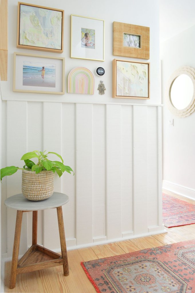

Maybe that’s bound to happen in any smaller home, but I can think of several modest homes I’ve been in with long hallways, defined foyers, or winding open staircases. I’m not saying those aren’t necessary or beautiful in many situations, but in a smaller home it can quickly eat up otherwise useful square footage.
For example, if we had a more grand staircase that opened to our kitchen on the right and overlooked that room, it would feel breezy but we would lose an entire 10′ run of kitchen cabinetry and a spot for the fridge. So in this case, we’d much rather have our floor-to-ceiling pantry cabinet and our built-in fridge than airy open stairs.
We’d also rather have room for a sitting area in the kitchen downstairs than have a defined foyer (just like we’d give up a long hallway for pretty much any other space we could all use as a family). You may remember our last house had a looooooong hallway upstairs and a generously-sized foyer. They made perfect sense for that house, but we’re grateful that most of the square footage here is more multi-functional than simply being an entry zone or a long hallway that you pass through.
So that’s what I mean when I say that minimizing those in favor of gaining more actual space to hang out versus pass through can definitely be a perk in a smaller house.
One Layout Warning: A First Floor Bedroom Off The Main Living Space
As much as we love the layout of the bedrooms in this house (it’s #1 above for a reason!) there is one thing that surprised us in how we all use this house – and while it works well for us (I repeat: we do not want to change this thing), it certainly could be a drawback for other people, depending on your preferences. So the layout caveat is: since our bedroom is located right off the downstairs living area, it sees a lot more family activity than our old bedroom ever did.
Our bedroom in our last house was upstairs at the far end of a hall, so we really only used it for sleeping and getting ready in the morning. We woke up in there and went to bed in there, but were hardly ever found in there at any other time of the day (we were usually downstairs on the main level). It wasn’t off-limits to our kids or anything, but there wasn’t much reason for them (or even us) to go in there throughout the day.
By contrast, since our current bedroom here is downstairs and located right off of the main living area (where we have our kitchen and often-used sitting area), we all just end up in our bedroom a lot more throughout the day. We’ll find the kids in there sprawled on our bed petting the dog or reading in the swivel chair by the fireplace. Sherry and I both have been known to work in there on occasion (at the table or in the swivel chair since we can close the door for privacy on a call or zoom meeting) and we sometimes do puzzles at the table with the kids. Our son even ranked the swivel chair in our bedroom as his favorite summer reading spot of all. Really, it won the entire bracket.
These aren’t bad things to us – it feels like an efficient and flexible way to share the largest three rooms in this house instead of keeping one all to ourselves – but it’s 100% correct to say that the bedroom often feels more like a communal space than a private space except at the end of the day when the kids are tucked into bed on the other side of the house (which is when it actually feels nice and private – see point #1 of this list).
So if you’re someone who treasures that feeling of having a bedroom sanctuary or a kid-free zone to escape to throughout the day (again: no issues after dark – but during the hangout hours ours definitely sees some traffic), I’d caution you that this layout just seems to draw people into the room all day long. Although you could argue that some of that could be furniture-related… perhaps if there wasn’t a swivel chair or a puzzle table by the fireplace (or a sweet dog in there to cuddle), the outcome might be different.
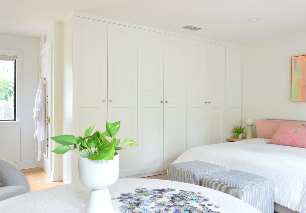

And of course, you could post one of those KEEP OUT signs that sitcom kids put on their doors when they’re feeling angsty or even make some sort of rule to deter anyone else from entering the room. In contrast, we just got a new puzzle for the puzzle table…
*This post contains affiliate links, so we may earn a small commission when you make a purchase through links on our site at no additional cost to you.
More posts from Young House Love
Credit : Source Post


